

The Worlds Collide Map
A chart for locating the pressure before misnaming the person.

The map is not the territory. It is the beginning.
What the Vocabulary Asked For
At some point, a vocabulary becomes large enough to need a chart.
Worlds Collide has reached that point.
Readers now have sharper language for what they already knew was hard. The Cultural Prediction Engine names why an old habit suddenly costs more. The Collision Tax names the fatigue no one warned them about. The Borrowed Compass names the wrongness of advice that once worked.
But the terms are accumulating faster than their relations are clarifying.
Two adjacent ideas get mistaken for each other. A concept built for one level is asked to do another level’s work.
The reader does not lack ideas. The reader lacks placement.
This essay does not introduce a new concept. It places the existing ones.
The map is a chart, not a discovery. It does not claim to reveal the structure of newcomer reality. It claims to make the canon’s existing terms easier to use against a real situation.
If this chart helps you locate a pressure you have only felt, restack it for someone still being misread by the room they are trying to enter.
The Maps That Already Exist
Other maps already exist.
Cross-cultural psychology has been at this work for decades: acculturation models, phase patterns, cultural intelligence, and ecological systems thinking. These maps matter because this essay is not claiming the field lacked structure until Worlds Collide arrived.
The claim is narrower.
Worlds Collide began with lived mechanisms of mismatch: what the mind anticipates, what accumulates when prediction fails, what time does to the cost, and what the navigator reaches for in response.
The question is not whether to map newcomer experience.
The question is what this map is of.
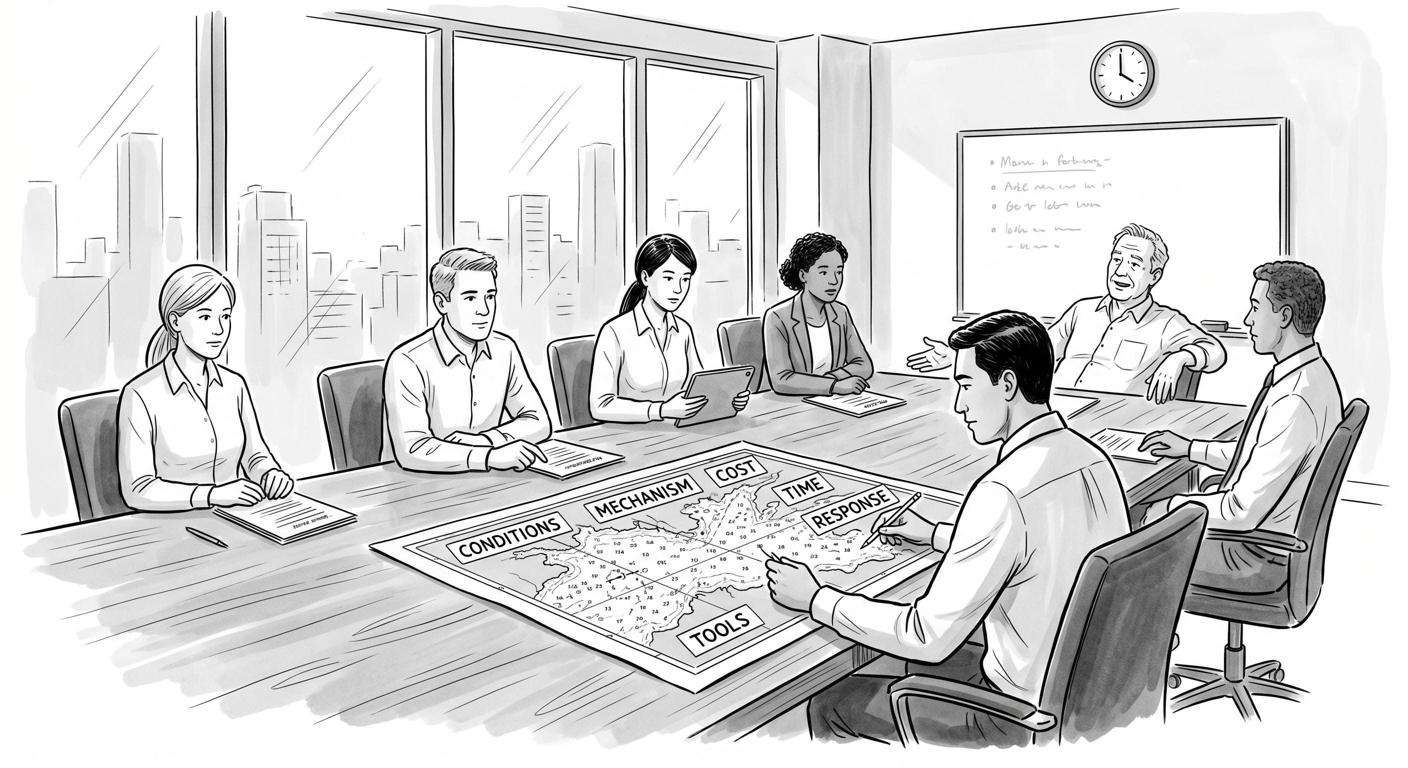
As you read the workplace example below, hold one situation from your own life in mind. Do not ask what went wrong. Ask where the pressure sat.
Six Questions, One Field
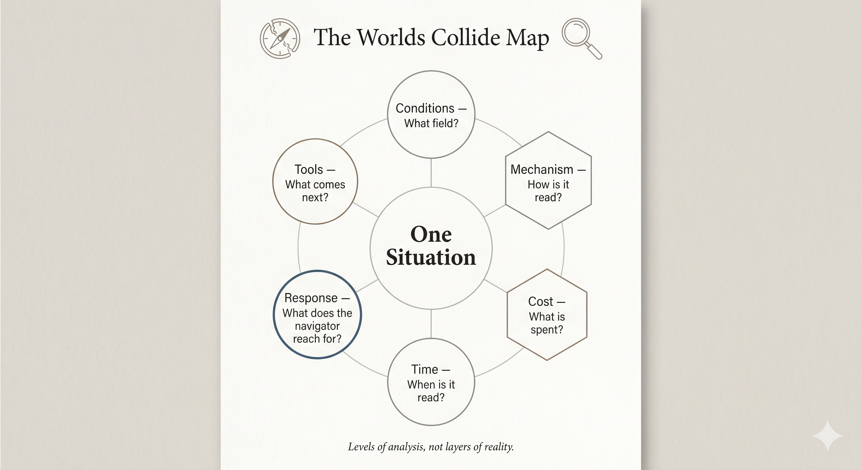
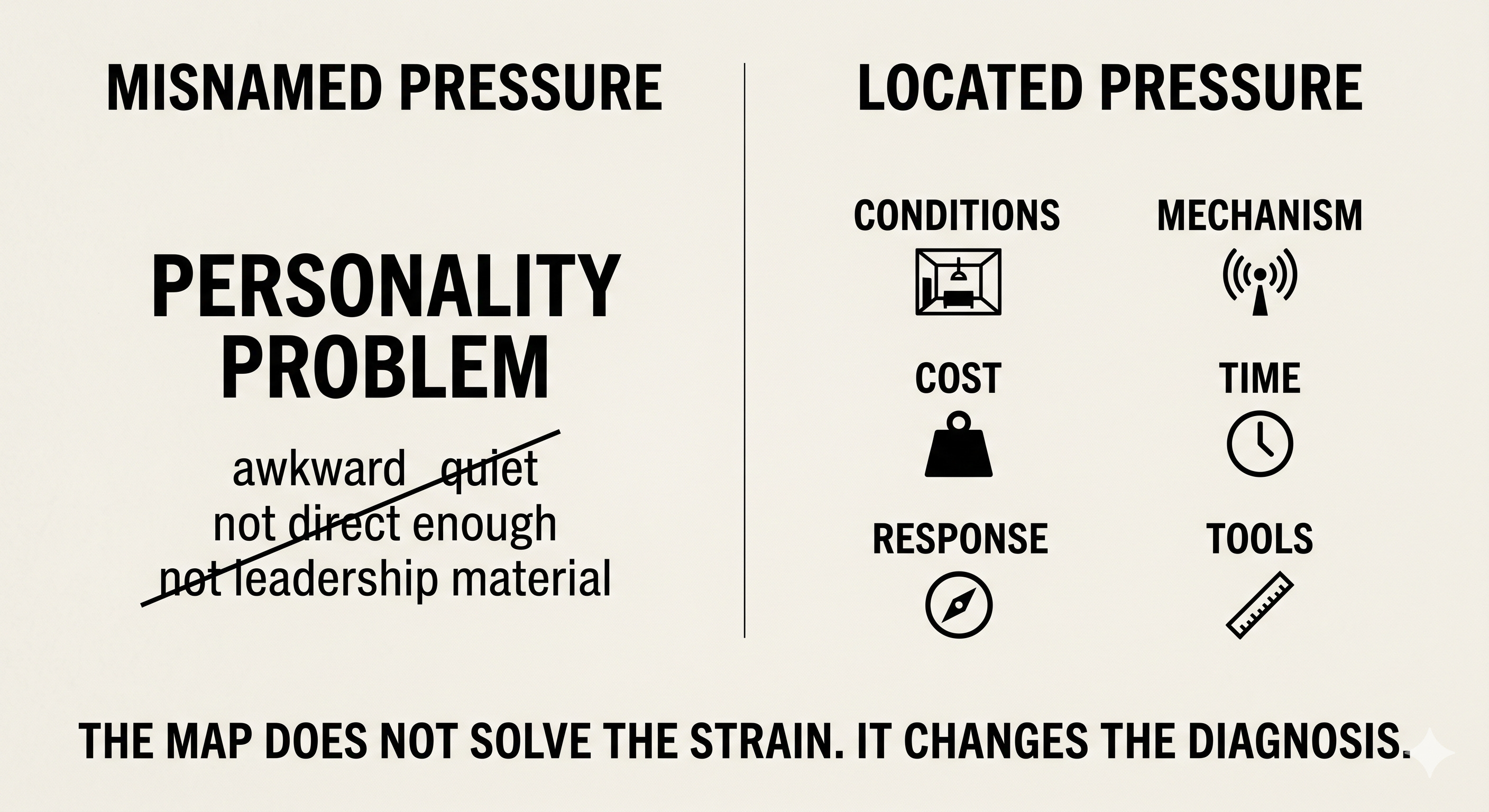
The canon’s terms are not equivalents. They answer different kinds of questions. Six levels of analysis are useful here.
They are not substances stacked on one another. They are six ways to read the same situation.
Conditions ask what field the newcomer is moving through. Three Forces belongs here: natural, cultural, institutional.
Mechanism asks how the field acts on the person. Cultural Prediction Engine belongs here because culture teaches expectation before the person notices expectation.
Cost asks what is being spent. The Collision Tax names the price in the moment. Simultaneous Reconfiguration Load names what compounds across domains. Context Fatigue names the exhaustion of repeated interpretation.
Time asks when the pressure is being read. The First 7 Years Curve belongs here as a phase pattern, not a universal calendar.
Response asks what the navigator reaches for. The Borrowed Compass names guidance calibrated for another field. The Normality Trap names compression into someone else’s template.
Tools ask what to do next. Concurrency Audit and Worlds Collide Index belong here as instruments built after placement becomes possible.
These levels clarify one another when read together. They do not claim to be the only possible arrangement.
If You Strip Away the Names
The strongest objection should be stated before it is answered.
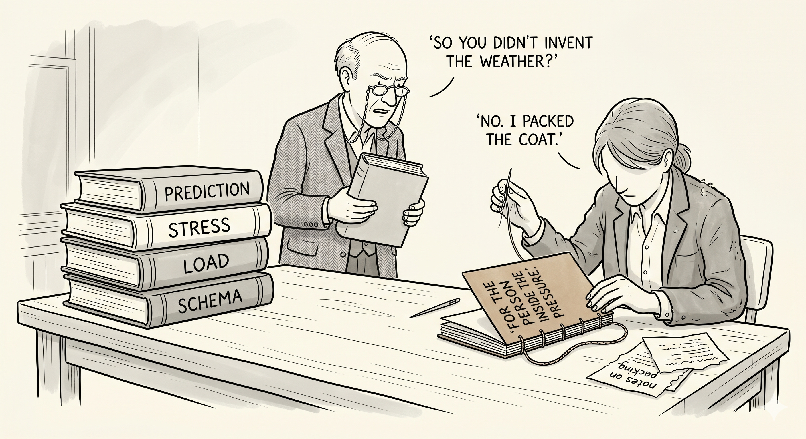
Strip away the coined terms and what remains? People enter new environments. Their expectations fail. Stress accumulates. Time changes the experience. People cope well or badly. The map adds nomenclature. The author arranged the terms, then mistook internal coherence for external necessity.
The skeptic is right about the danger.
Predictive processing, allostatic load, cognitive load, and schema theory already do much of the scientific work beneath the canon. The mechanisms are not the canon’s discovery.
The claim is composition.
That is smaller than the canon’s prior posture sometimes suggested. It is also more useful. A technical term can be true and still fail the person inside the pressure. A newcomer can be carrying prediction error, cognitive load, accumulated stress, and role conflict without having usable language for the room they are in.
The project does not invent the forces. It composes them into a language the person inside the pressure can use.
Usefulness does not always require discovery.
What a Chart Is For
The map is heuristic, not holy.
It does not claim to mirror the structure of newcomer reality. It claims to make many common moments of strain easier to read against a single chart.
A nautical chart marks depths, currents, and hazards. It does not promise safe passage. It does not pretend the sea is arranged for the cartographer. It does not flatten the sea. It makes the rocks visible.
Korzybski’s old warning applies here: a map is not the territory. This map is not the newcomer’s life. It is a reading instrument placed beside it.
The six levels are an arrangement, not an ontology. Their virtue is practical: they keep different questions from collapsing into one misnamed problem.
The interactions between levels are observed patterns, not laws. Response failures often mask the conditions that produced them. Time alters which costs dominate. Tools misfire when they measure behavior without reading the field that made the behavior rational.
Names make the field walkable.
Not because the names are final. Because the navigator who can name what pressure is doing has a better chance of refusing the wrong explanation for it.
One Situation, Six Levels
Consider one plain situation.
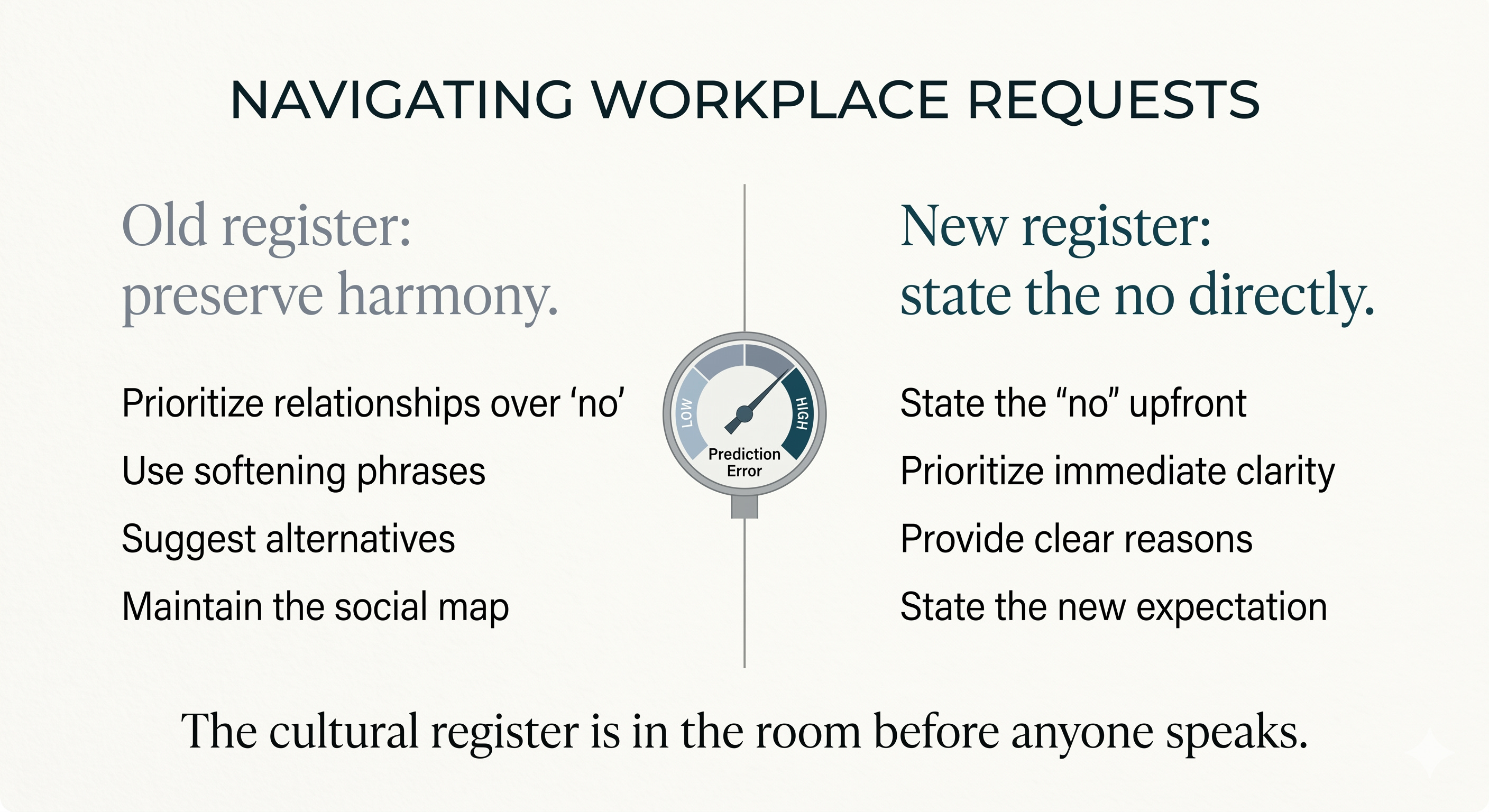
A newcomer enters a workplace where meetings run on a register their training did not prepare them to read. Decisions seem to be made before the meeting starts. Silence may mean agreement, dissent, or invitation. Output is good. Reception is uneven.
Within months, the newcomer is told to “communicate better.”
Read the situation across the six levels.
Conditions. The workplace has decision rhythms, meeting rules, and hierarchy signals that are obvious only to people already trained by them. The cultural register is in the room before anyone speaks.
Mechanism. The newcomer’s predictive model of meeting was built elsewhere. The inherited cues no longer predict outcomes reliably. The engine registers that something is wrong before it knows where the wrongness sits.
Cost. Each meeting now extracts more attention than it would from someone whose predictive model already fits the room. This is where the Collision Tax and Simultaneous Reconfiguration Load begin to separate: one names the price; the other names the concurrency.
Time. Six weeks in, the strain reads as adjustment. Eighteen months in, the same strain can read as a personality flaw. Time does not create the pressure. It changes what the pressure is taken to mean.
Response. The advice arrives clean and confident: speak up more, be more direct, build relationships proactively. Some of it may help. But if it is calibrated only for the room’s existing rhythm, it treats field mismatch as personal shortage.
Tools. A diagnostic would not begin with “Why is this person struggling in meetings?” It would ask which pressures are active, which are compounding, and which response is mislocating the strain.
The map does not solve the situation.
It changes the diagnosis.
The failure was not inside the person. It was in the reading of the field.
From Chart to Instrument
Two essays follow this one.
Concurrency Audit puts a diagnostic on top of the chart. Worlds Collide Index attempts the harder task: a score for multi-domain reconfiguration load. Both need the map. Neither replaces it.
The limits remain.
This is one possible arrangement. The names are provisional. The interactions are working hypotheses, not validated laws. The framework borrows from existing science where it can and owns its synthesis where the science does not yet reach.
A stronger future version would ask which interactions across the levels are real, which are artifacts of the arrangement, and what evidence would force revision.
That is not a defect. It is the price of honest mapping.
A closed map becomes doctrine. A useful map stays revisable.
The value of this chart is not whether it impresses the cartographer. The value is whether it helps the navigator locate pressure before accepting the wrong explanation for it.
A chart is judged by whether the navigator returns.
If this map helped you locate a pressure you had only felt, share or restack it for someone still being misread by the room they are trying to enter.
The wrong diagnosis turns field pressure into character failure.
For institutions, leaders, and high-performing newcomers:
I help teams and individuals diagnose the pressures that talent language often misses — field mismatch, reconfiguration load, hidden costs, and response failures. If your organization is trying to support people navigating new cultural, institutional, or professional worlds, this is the work.
The cost layer is the one that usually gets skipped — people jump straight to response and wonder why it doesn’t stick.
I work in a different field but the misread runs the same way. The pressure gets named as a personal problem before anyone looked at what the field was doing to them.